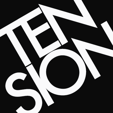
Tension
“Word Essence” project. Student work. 2013.
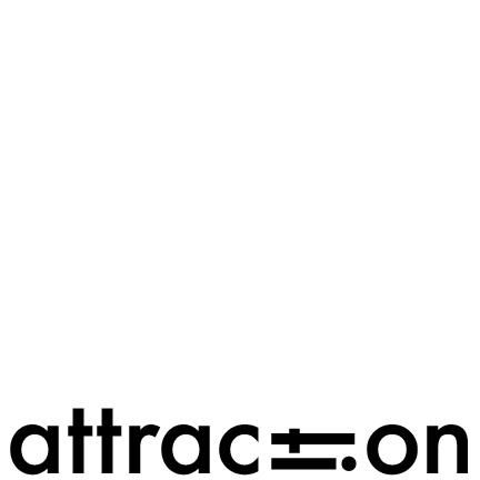
Attraction
“Word Essence” project. Student work. 2013.
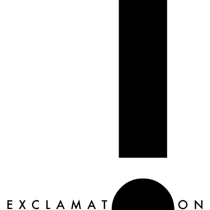
Exclamation
“Word Essence” project. Student work. 2013.
Notes about this work
When I was really young, my parents were watching “60 Minutes” and I wasn’t paying much attention. Until someone on screen pointed out that there’s an arrow inside of the FedEx logotype—part of the company’s 1994 rebranding. This is my earliest memory of typography and graphic design. My fondnesses for Bodoni, Futura, and Univers followed much later.
I thoroughly enjoyed my college coursework in printing and graphic design: sketching, digital typography, screen printing, letterpress… I’m sharing some of my work here today.
“Word Essence” (above) was a classic typography project that I still practice today for creative exercise. One of my friends and I shared a presentation about the history of the lovely slab serif (below).
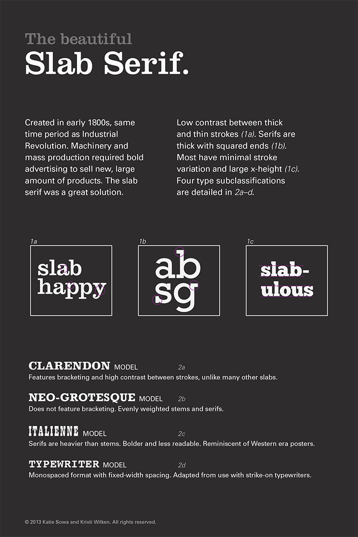
Presentation Handout
“History of the Slab Serif” project. Student work. 2013.
CREATIVE CHALLENGES
Experimental Alphabet
I’ll always love a geometric typeface and the micromanagement of kerning. I’m also down for the challenges of hand lettering and illustrative type.
Back in 2019, one of my managers brought a friend to visit and lead a workshop in experimental type. Jeremiah Chiu’s project brief: Illustrate your own experimental alphabet, mapping your bespoke typeface back to a source of inspiration.
After sketching and discussing first impressions, we each went to work and isolated four distinct shapes. We used each figure to craft a complete alphabet.
The leaves of Monstera deliciosa were already on my mind. I referenced the plant’s stalks and stems to create the light strokes in my typeface. The plant’s fenestrations create a negative space in its leaves, and I referenced these “missing” pieces for the round shapes and heavy strokes.
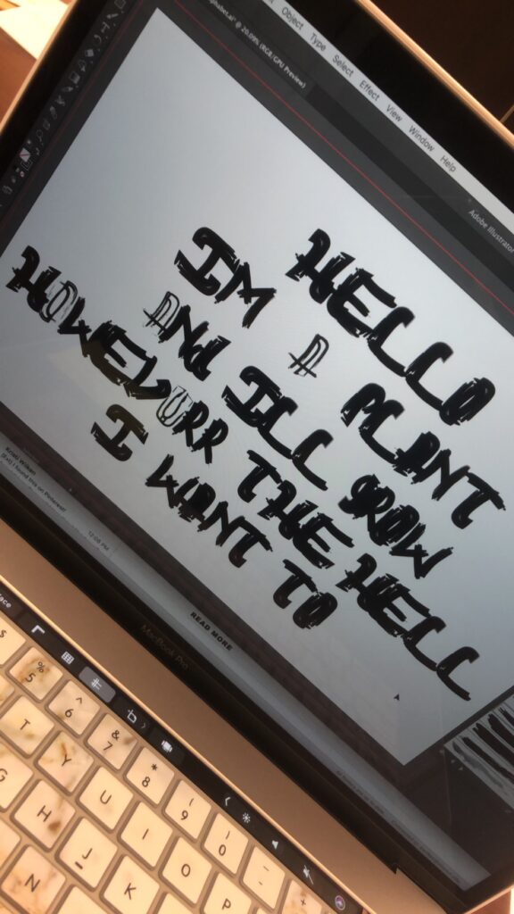
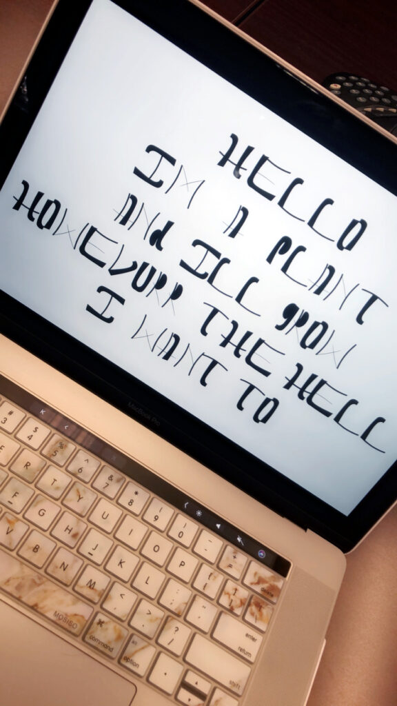
Unfortunately, this might be the only project for which I’ve lost my original artwork. I have a few photos that I snapped after the workshop wrapped, but I haven’t seen the Illustrator files since then.
I remember feeling frustrated with the shapes I’d created as I rotated and reflected them into letterforms. The organic, unyielding nature of the shapes wasn’t as pleasing as I’d imagined. It turned out that I’d have preferred something geometric, more delicate, or glamorous.
But I value the follow through. In this case, done was better than perfect, and I enjoyed the creative challenge in simply carrying an idea through to completion.